Get more out of your RAPIDI integration Using the Statistics Graphs
We are pleased to announce that our newly refined and improved statistics pages are available on app5.myrapidi.com.
We have been asking you about your opinion on our statistics pages and we have listened to your suggestions and redesigned the statistics pages.
The ancient statistics pages only showed tabular data and it was not easy to get the sense out the data displayed.
The redesigned pages now include multiple graphs from the underlying tabular data (still available under Transfers Statistics and Data Statistics).
The main goal for the redesign was to display data that you would be able to understand and act on in order for you to optimise your integration setup to ensure that data is transferred in an efficient and timely manner.
With feedback from you and our own thoughts and experience on what would be relevant to show we have implemented several graphs to illustrate different scenarios or situations.
We have divided relevant statistics into multiple pages: Runs Time Used, Transfer Time Used, Salesforce API Calls (only when Salesforce Connection(s)).
Below we will explain each page/area; how you read and use the data what you can do to optimise your data integration setup.
Runs Time Used
Scheduler Runs Time Used per day - 24 Hours
The first graph sums up the time used on Schedules for 24 hours. The time where no Schedules have run is marked as idle time.
Firstly, this graph should help you to see how busy this service is.
Secondly, it will help you identify Schedules that take up the most time.
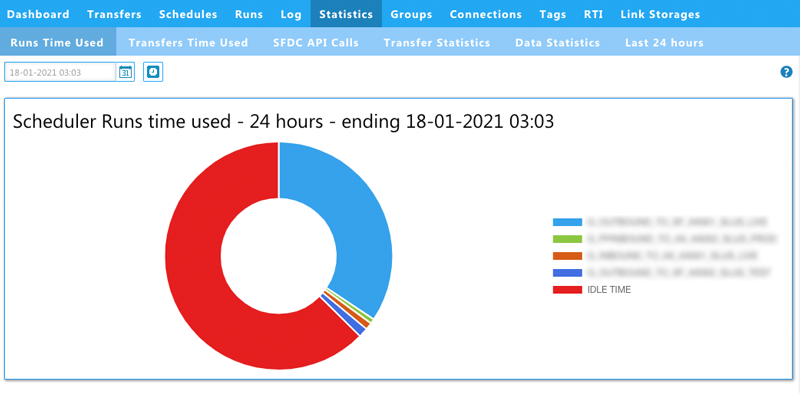
This view should help you identify the Schedules that maybe would take a long or longer time than expected.
Filtering Options:
You can use the filter at the top of the page to specify the ending date and time for your graph and you can filter on a specific Schedule.
Scheduler Runs Time Used per hour - 24 hours
The second graph shows Scheduler Runs Time used per hour for a 24 hour period. Time used on Schedules in shown in the hours of the day where it is used. All the Schedulers Runs are summed up and we have marked the maximum time available with a limit line at 3600 seconds (=1 Hour).
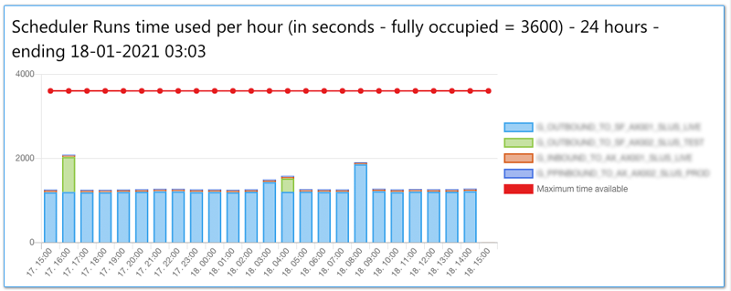
This view you can use to see when the Scheduler is busy during a 24 hour period. This can help you to identify when you can schedule additional jobs.
Scheduler Runs time used Daily - 10 day period
The third graph shows Schedules run time used per day over a 10-day period.
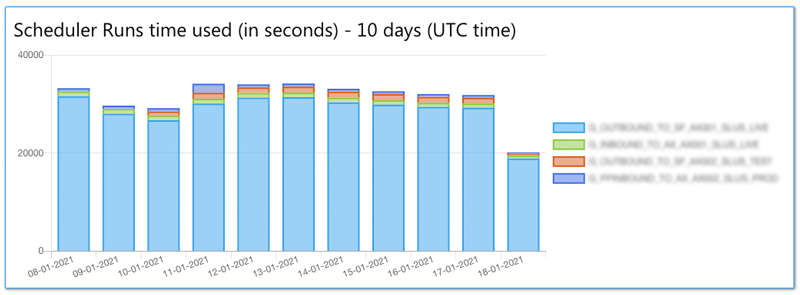
This view should help you see which days the Scheduler is most busy during a 10 day period.
Manual Runs time used per hour (in seconds) - 24 hours
The last graph on this page shows manual run time used per hours in seconds for a 24 hour period
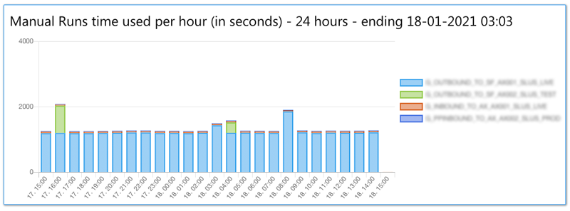
This view you can use to see when the Service has been busy with manual transfer runs.
Filtering Options
You can always use the filter at the top of each page to narrow down your view to either a specific to date or you can filter on a specific Schedule.
Transfers Time Used
This graph shows the Transfers running in the specified time interval (defaults to the last 24 hours) including the time they have used and how much data was transferred - such as records read, added, updated or deleted.
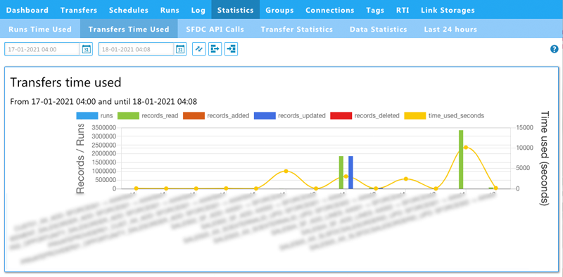
This view should help you identify specific transfers that might need to be investigated to optimise their setup.
Filter Options
Also here you can apply some filters to drill down into specific data. You can filter on transfer, source and destination in addition to setting the time interval.
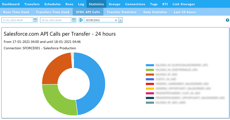
SFDC API Calls (only when Salesforce connections)
This page will be available when you have one or more Salesforce connections.
Salesforce API Calls - 24 hours
The first graph shows Salesforce API calls per Transfer in a 24 hour period.
Here you will be able to see how many API calls each Transfer is using in a 24-hour period.
By default the view is filtered on the first Salesforce connection and the last 24 hours. You can of course choose another Salesforce connection from the drop-down in the filter or set another time interval.
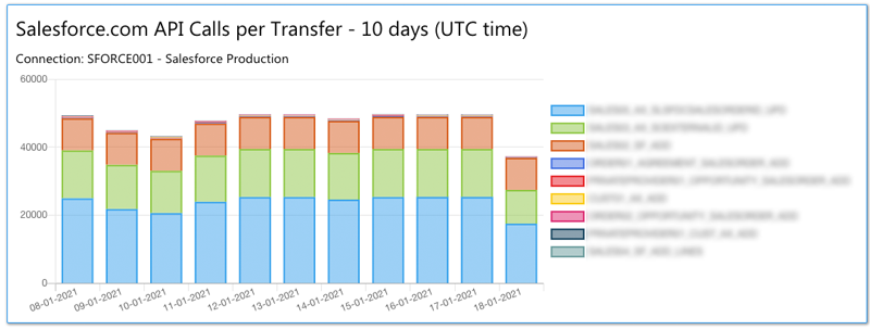
Salesforce API Calls Daily
The second graph sums up daily API calls per Transfer in a 10 day period. If you wish to change the date range for the view you can do so in the filter to and from date.
General Viewing options (Legends)
Clicking on the legends in each graph will either disable or enable them. Per default everything is shown. Hovering over each graph and specific area in the graph will display the name of the Transfer/Schedule.
More ideas
We hope you like the new statistics pages and get more out of the data shown.
We highly encourage you to log in to app5.myrapidi.com to take advantage of the newly designed statistics pages.
If you have any ideas or wishes on what we should display under those Statistics please don't hesitate to contact us.
Learn more on our Live Webinar
Learn more about the statistics in our January 2021 webinar series. Learn more about statistics in our webinar

About the author
Beate Thomsen, Co-founder & Product Design
As Co-Founder of the Rapidi Data Integration platform, Beate has spent over 2 decades on its development, building it around her motto: 'keep it simple, functional yet beautiful.' She holds a Master Degree in IT, Management and Communication and always sees herself as neverending business development entrepreneur with the passion for helping businesses transform, grow and streamline their business operations through Rapidi.